# 代码来源:https://www.r2omics.cn/
# 加载所需的库 ------------------------------------------------------------
library(tidyverse)
library(survival)
library(timeROC)
library(ggstyle) # 开发版安装方式devtools::install_github("sz-zyp/ggstyle")
# 读取数据 --------------------------------------------------------------------
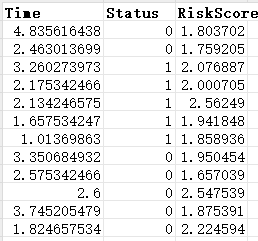
dfKM = read.delim("https://www.r2omics.cn/res/demodata/timeROC.txt")
# 进行时间依赖性ROC分析 ------------------------------------------------------
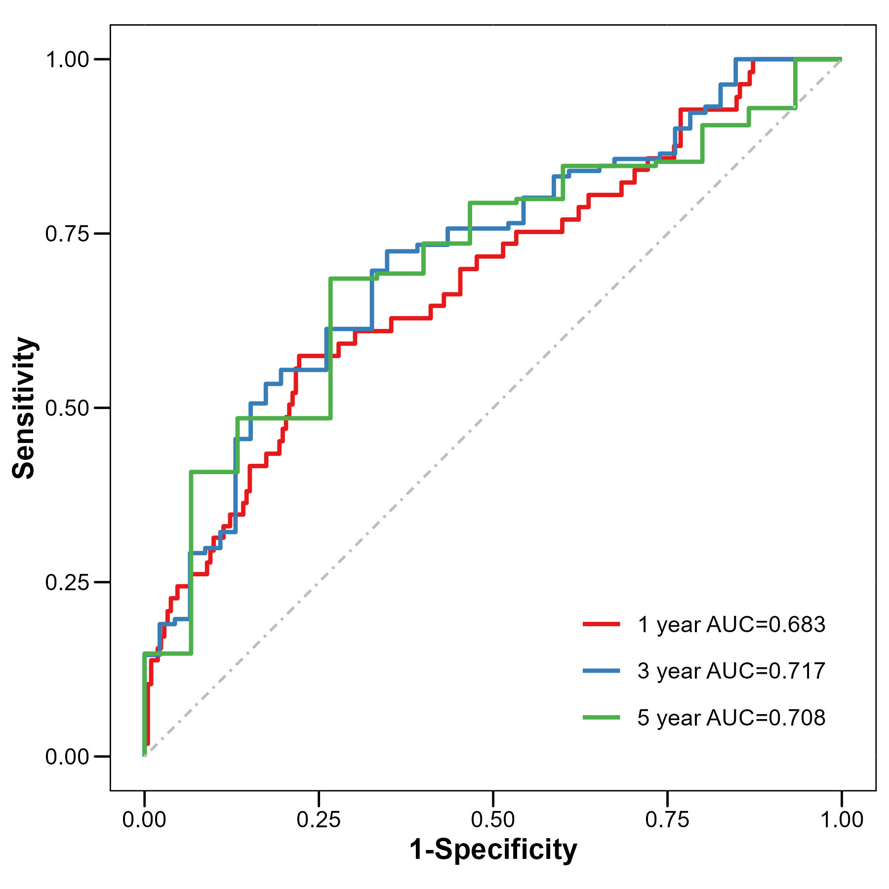
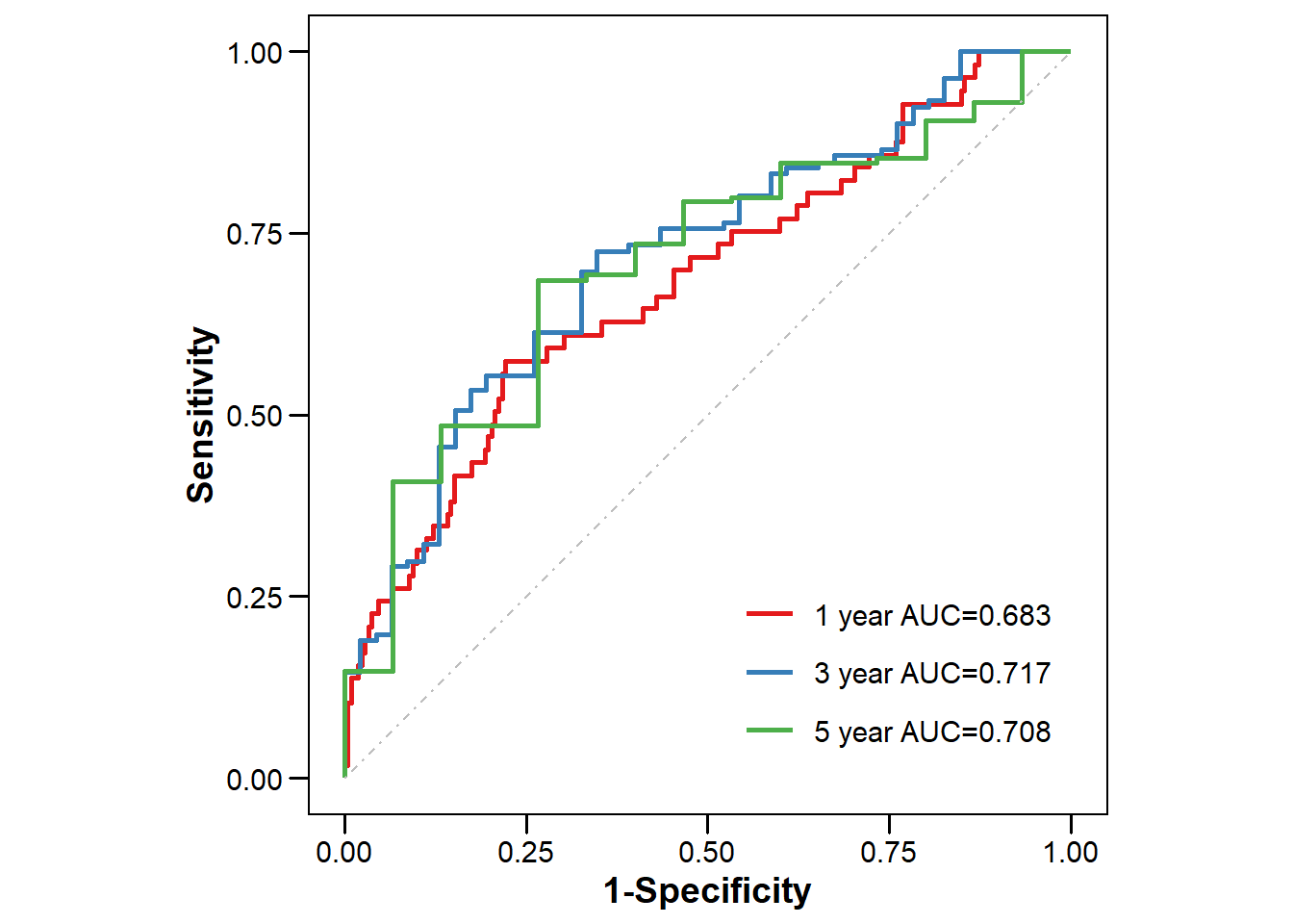
years = c(1, 3, 5) # 设置需要计算AUC的预测时间点,1年、3年、5年
ROC2 = timeROC(
T = dfKM$Time, # 生存时间
delta = as.numeric(dfKM$Status),# 结局状态(生死,转化为数值型)
marker = dfKM$RiskScore, # 风险评分(作为预测变量)
cause = 1, # 阳性结局赋值为1
weighting = "marginal", # 权重计算方法,"marginal"表示采用Kaplan-Meier估计删失分布
times = years, # 指定预测的时间点:1年、3年、5年
iid = F # 设置为F,因为只有使用"marginal"时才能计算置信区间
)
# 整理结果并绘图 --------------------------------------------------------
# 整理数据
dfAUC = ROC2$AUC %>%
data.frame() %>%
set_names("AUC") %>%
rownames_to_column("Group") %>%
mutate(Group = str_remove(Group, "t=")) %>%
tibble()
dfPlot = bind_cols(
ROC2$TP %>% data.frame(check.names = F) %>% set_names(paste0("TP_", years)),
ROC2$FP %>% data.frame(check.names = F) %>% set_names(paste0("FP_", years))
) %>%
mutate(row_number = row_number()) %>%
pivot_longer(-row_number, names_to = "Sample", values_to = "Value") %>%
separate(Sample, into = c("Type", "Group"), sep = "_") %>%
pivot_wider(names_from = Type, values_from = Value) %>%
left_join(dfAUC) %>%
mutate(Label = paste0(Group, " year AUC=", round(AUC, 3))) # 创建AUC标签,显示为"1 year AUC=0.85"
# 绘图
ggplot(dfPlot, aes(x = FP, y = TP,
group = factor(Label, levels = unique(Label)),
color = factor(Label, levels = unique(Label)))) +
geom_line(size=1) +
geom_segment(aes(x = 0, y = 0, xend = 1, yend = 1),
colour = 'grey',
linetype = 'dotdash'
) +
labs(x = "1-Specificity", y = "Sensitivity", color = "") +
ggstyle::scale_color_sci(palette = "Set1",modeColor = "1")+ # 设置颜色
ggstyle::theme_style1()+ # 设置主题
theme(
legend.position = c(0.95, 0.05), # 设置图例位置在右下角
legend.justification = c(1, 0) # 设置图例对齐方式为右下角
)+
coord_fixed(ratio = 1) # 设置坐标轴比例为1:1,确保X轴和Y轴比例一致