# 代码来源:https://www.r2omics.cn/
library(tidyverse)
library(ggalluvial)
library(patchwork)
library(ggstyle) # 开发版安装方式devtools::install_github("sz-zyp/ggstyle")
# 读取数据
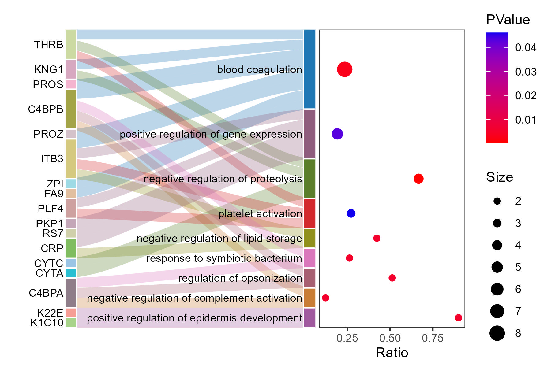
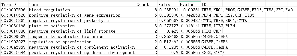
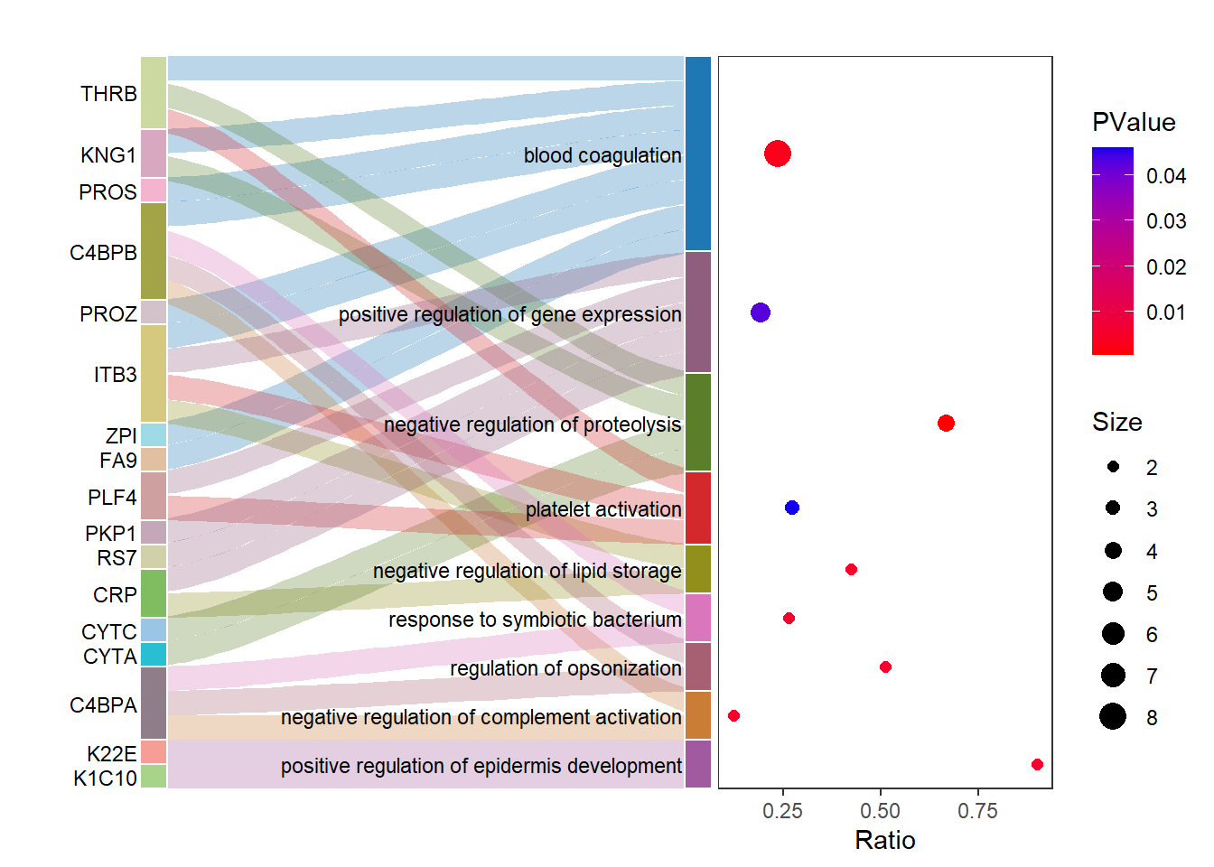
df = read.delim("http://r2omics.cn/res/demodata/sankeyBubble.txt")
# 整理数据
dfLong = df %>%
separate_rows(IDs,sep = ",") %>%
mutate(Term = factor(Term)) %>%
mutate(IDs = factor(IDs))
# 准备桑基图数据
dfSankey = to_lodes_form(dfLong %>% select(c("IDs","Term")),
key = "x",
axes = c(1,2)) %>%
mutate(flowColor = rep(dfLong$Term,2))
# 绘制桑基图
sankeyPlot=ggplot(data = dfSankey,
aes(x = x,
stratum = factor(stratum,levels = unique(stratum)),
alluvium = alluvium,
y = 1,
label = stratum,
fill = stratum
)) +
scale_y_discrete(expand = c(0, 0)) +
geom_flow(aes(fill = flowColor),alpha = 0.3, width = 0, knot.pos = 0.1) +
geom_stratum(width = 0.05, color = "white") +
geom_text(stat = "stratum", aes(label = after_stat(stratum)), size = 3,
hjust = 1, nudge_x = -0.03) +
guides(fill = FALSE, color = FALSE) +
theme_minimal() +
labs(title = "", x = "", y = "") +
theme(
axis.text.x = element_blank(),
axis.ticks.x = element_blank(),
plot.margin = unit(c(0, 0, 0, 0), units = "cm")
)+
scale_x_discrete(expand = c(0.2, 0, 0, 0))+
ggstyle::scale_fill_sci(palette="d3.category20")
# 准备气泡图数据
bubbleDf = df %>%
mutate(Term = factor(Term,levels = rev(df$Term))) %>%
arrange(Term) %>%
mutate(Term_num = cumsum(Count) - Count / 2)
# 绘制气泡图
dot_plot <- ggplot(bubbleDf, aes(x = Ratio, y = Term_num,color=PValue)) +
geom_point(aes(size = Count)) +
scale_y_continuous(expand = c(0, 0),limits =c(0,sum(bubbleDf$Count,na.rm = T)))+
scale_color_gradient(low = "red", high = "#1000ee") +
scale_radius(
range=c(2,5),
name="Size")+
guides(
color = guide_colorbar(order = 1), # 决定图例的位置顺序
size = guide_legend(order = 2)
)+
theme_bw() +
labs(size = "Count", color = "PValue", y = "", x = "Ratio") +
theme(
axis.text.y = element_blank(),
axis.ticks.y = element_blank(),
axis.title.y = element_blank(),
plot.margin = unit(c(0, 0, 0, 0), "inches"),
panel.grid = element_blank()
)
# 合并桑基图和气泡图
sankeyPlot + dot_plot +
plot_layout(widths = c(2, 1))