# A tibble: 2,319 × 2
   Gene     intensity
   <chr>        <dbl>
 1 Gene1  26309304832
 2 Gene2   6350142776
 3 Gene3   5906849872
 4 Gene4   3432857760
 5 Gene5   2794144308
 6 Gene6   2502199344
 7 Gene7   2390313375
 8 Gene8   2368543256
 9 Gene9   1944088984
10 Gene10  1706848395
# ℹ 2,309 more rows
R语言如何绘制动态变化范围图
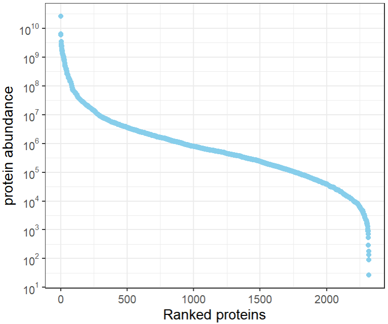
什么是动态变化范围图
蛋白定量值特征分布可以通过绘制动态变化范围图查看。
什么是动态变化范围图呢?对蛋白定量值从高到低排序后,绘制散点图。可以用来展示鉴定蛋白总数,定量检测数量级范围,以及定量值密集分布程度。
绘图前的数据准备
包含2列数据,第一列为蛋白基因等名称,第二列是定量值等数值信息。
demo数据可以从这下载:https://www.r2omics.cn/res/demodata/pointRank.txt
R语言如何绘制动态变化范围图
# 代码来源:https://www.r2omics.cn/
# 绘图思路为先排序,再绘制散点图
library(tidyverse)

# 读取数据
df = read.delim("https://www.r2omics.cn/res/demodata/pointRank.txt")

# 处理数据,排序
df = df %>%
  arrange(desc(intensity)) %>%
  mutate("x" = row_number())

# 绘图
ggplot(df,
       aes(
         x = x,
         y = intensity
       )
)+
  geom_point(color="skyblue")+
  theme_bw()+
  labs(
    x = "Ranked proteins",
    y = "protein abundance"

  )+
  scale_y_continuous(breaks = 10^(-100:100), # 调整y轴的坐标轴样式为10^1,10^2...
                     labels = scales::trans_format("log10", scales::math_format(10^.x)),
                     trans="log10")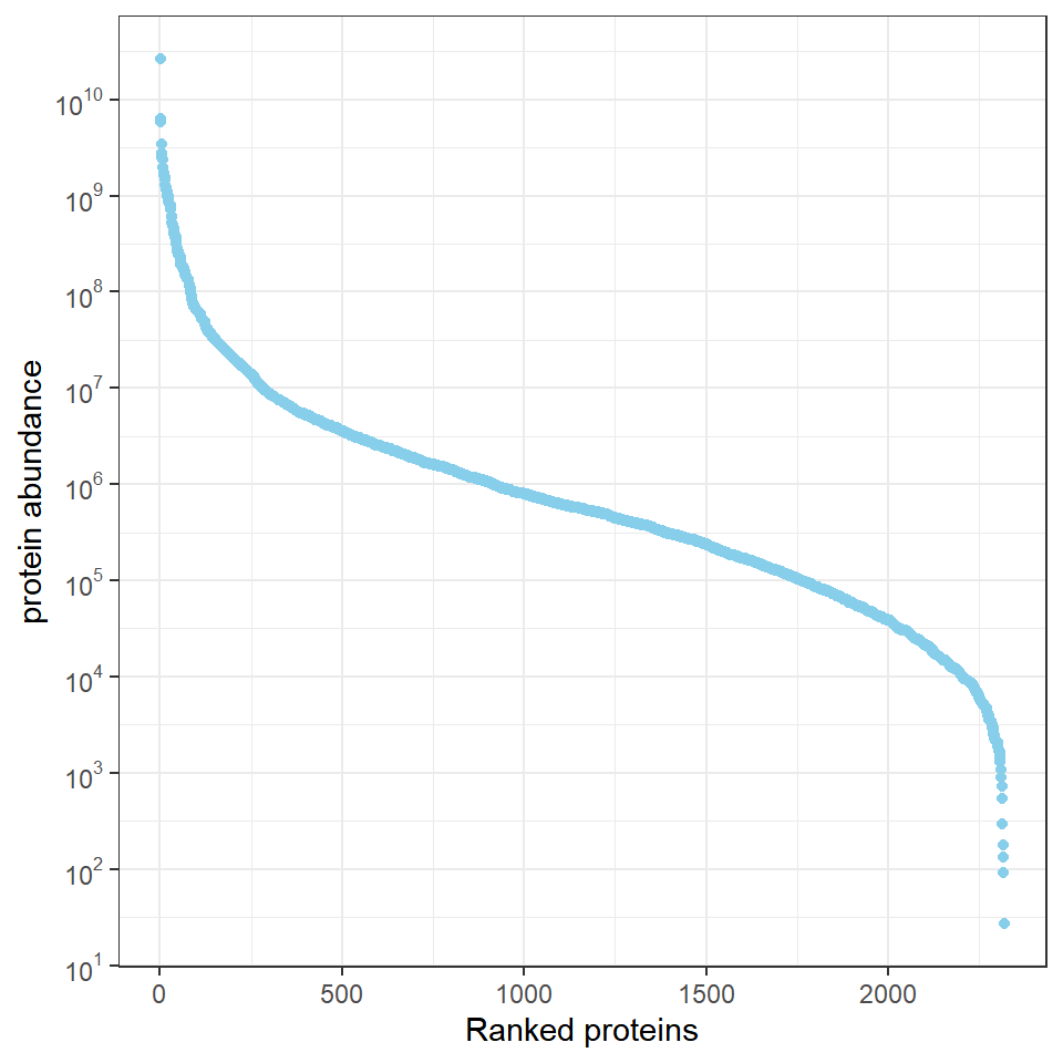
当然,还可以用geom_text()函数把目的蛋白标记在图上,看它们是低丰度蛋白还是高丰度蛋白。