# A tibble: 4,586 x 4
   Name     FC  PValue Cluster
   <chr> <dbl>   <dbl> <chr>
 1 ID1   0.139 0.00749 Z VS B
 2 ID2   1.19  0.801   Z VS B
 3 ID3   0.777 0.00172 Z VS B
 4 ID4   2.42  0.0391  Z VS B
 5 ID5   0.840 0.747   Z VS B
 6 ID6   1.80  0.00173 Z VS B
 7 ID7   2.47  0.0164  Z VS B
 8 ID8   1.76  0.00967 Z VS B
 9 ID9   0.964 0.923   Z VS B
10 ID10  0.746 0.510   Z VS B
# i 4,576 more rowsR语言如何绘制多组差异火山图
前言
本篇是R语言如何绘制多组差异火山图的教程,普通的火山图内容介绍可以看这里:https://www.r2omics.cn/docs/gallery/omicsChart/volcano/volcano.html
什么是多组差异火山图?
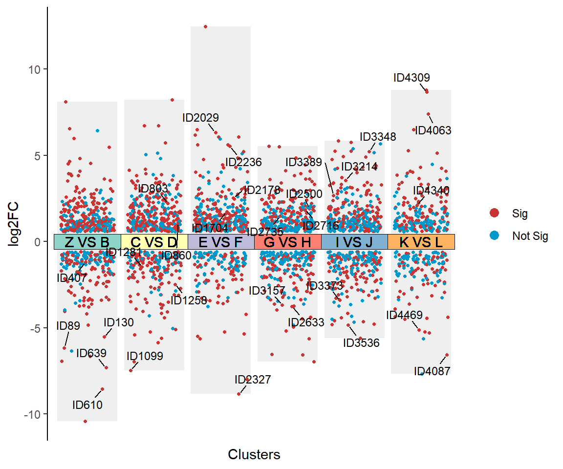
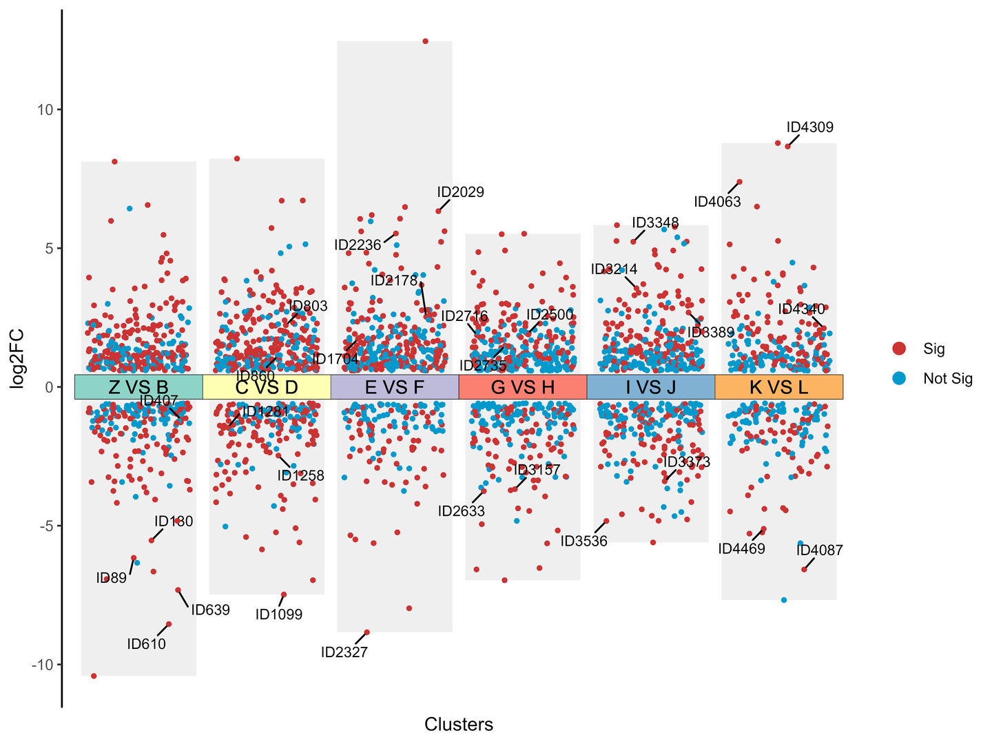
多组差异火山图是火山图的变种,与传统的火山图相比,可以在一张图上展现多个比较对的差异情况。
纵坐标表示基因或蛋白质的表达水平变化倍数log2FC,横坐标每簇代表一个比较对。在一张图上可以同时展示多个比较对,通过颜色的使用,将差异与非差异区分出来,帮助研究人员更清晰地了解不同样本间的差异情况。
绘图前的数据准备
demo数据可以在https://www.r2omics.cn/res/demodata/mutiVolcano.txt下载。
必须包含4列数据。4列分别是名称列,FC列,PValue列,Cluster列(比较对列)
R语言怎么画多组差异火山图
先自定义一个函数,之后我们直接调用它
# 代码来源:https://www.r2omics.cn/
#加载包
library(tidyverse)
library(ggrepel)   # 用于标记

# 自定义一个函数,之后我们直接调用它
mutiVolcano = function(df,         # 绘图数据
                       P = 0.05,   # P值卡值
                       FC = 1.5,   # FC卡值
                       GroupName = c("Sig","Not Sig"),      # 分组标签
                       pointColor = c("#CC3333","#0099CC"), # 分组散点的颜色
                       barFill = "#efefef",  # 柱子的颜色
                       pointSize = 0.9,      # 散点的大小
                       labeltype = "1",      # 标记差异基因的选项,标记类型有"1"和"2"两种选项
                       labelNum = 5,         # 当标记类型为1时,待标记的散点个数
                       labelName =NULL,      # 当标记类型为2时,待标记的散点名称
                       tileLabel =  "Label", # 标记比较对的选项,选项有“Label”和“Num”,Label时显示分组名称,Num时显示数字,防止因为标签太长导致的不美观
                       tileColor = NULL      # 比较对的颜色
                       ){
  # 数据分组 根据p的卡值分组
  dfSig = df %>%
    mutate(log2FC = log2(FC)) %>%
    filter(FC>{{FC}} | FC <(1/{{FC}})) %>%
    mutate(Group = ifelse(PValue<0.05,GroupName[[1]],GroupName[[2]])) %>%
    mutate(Group = factor(Group,levels=GroupName)) %>%
    mutate(Cluster = factor(Cluster,levels=unique(Cluster)))   # Cluster的顺序是文件中出现的顺序

  # 柱形图数据整理
  dfBar = dfSig %>%
    group_by(Cluster) %>%
    summarise(min = min(log2FC,na.rm = T),
              max = max(log2FC,na.rm = T)
              )
  # 散点图数据整理
  dfJitter = dfSig %>%
    mutate(jitter = jitter(as.numeric(Cluster),factor = 2))
  dfJitter

  # 整理标记差异基因的数据
  if(labeltype == "1"){
    # 标记一
    # 每组P值最小的几个
    dfLabel = dfJitter %>%
      group_by(Cluster) %>%
      slice_min(PValue,n=labelNum,with_ties = F) %>%
      ungroup()
  }else if(labeltype == "2"){
    # 标记二
    # 指定标记
    dfLabel = dfJitter %>%
      filter(Name %in% labelName)
  }else{
    dfLabel = dfJitter %>% slice()
  }

  # 绘图
  p = ggplot()+
    # 绘制柱形图
    geom_col(data = dfBar,aes(x=Cluster,y=max),fill = barFill)+
    geom_col(data = dfBar,aes(x=Cluster,y=min),fill = barFill)+
    # 绘制散点图
    geom_point(data = dfJitter,
               aes(x = jitter, y = log2FC, color = Group),
               size = pointSize,
               show.legend = NA
               )+
    # 绘制中间的标签方块
    ggplot2::geom_tile(data = dfSig,
                       ggplot2::aes(x = Cluster, y = 0, fill = Cluster),
                       color = "black",
                       height = log2(FC) * 1.5,
                       # alpha = 0.3,
                       show.legend = NA
                       ) +
    # 标记差异基因
    ggrepel::geom_text_repel(
      data = dfLabel,
      aes(x = jitter,                   # geom_text_repel 标记函数
          y = log2FC,
          label=Name),
      min.segment.length = 0.1,
      max.overlaps = 10000,                    # 最大覆盖率,当点很多时,有些标记会被覆盖,调大该值则不被覆盖,反之。
      size=3,                                  # 字体大小
      box.padding=unit(0.5,'lines'),           # 标记的边距
      point.padding=unit(0.1, 'lines'),
      segment.color='black',                   # 标记线条的颜色
      show.legend=F)#+

  if(tileLabel=="Label"){
     p =
      p +
      geom_text(data = dfSig,aes(x = Cluster,y = 0,label = Cluster))+
      ggplot2::scale_fill_manual(values = tileColor,
                                 guide = NULL # 不显示该图例
                                 )
  }else if(tileLabel=="Num"){
    # 如果比较对的名字太长,可以改成数字标签
    p =
      p +
      geom_text(data = dfSig,aes(x = Cluster,y = 0,label = as.numeric(Cluster)),show.legend = NA)+
      ggplot2::scale_fill_manual(values = tileColor,
                                 labels = c(paste0(1:length(unique(dfSig$Cluster)),": ",unique(dfSig$Cluster))))
  }


  # 修改主题
  p = p+ggplot2::scale_color_manual(values = pointColor)+
    theme_classic()+
    ggplot2::scale_y_continuous(n.breaks = 5) +
    ggplot2::theme(
                   legend.position = "right",
                   legend.title = ggplot2::element_blank(),
                   legend.background = ggplot2::element_blank(),
                   axis.text.x = element_blank(),
                   axis.ticks.x = element_blank(),
                   # axis.title.x = element_blank(),
                   axis.line.x = element_blank()
                   ) +
    ggplot2::xlab("Clusters") + ggplot2::ylab("log2FC") +
    # ggplot2::guides(fill = ggplot2::guide_legend())
    guides(color = guide_legend(override.aes = list(size = 3)))

    return(p)
}
调用刚才的自定义函数
# 代码来源:https://www.r2omics.cn/
# 读数据
df = read.delim("https://www.r2omics.cn/res/demodata/mutiVolcano.txt") %>%  # 这里直接读取网络上的数据
  as_tibble() %>%
  set_names(c("Name","FC","PValue","Cluster"))

# 调用函数画图
mutiVolcano(
  df = df,    # 绘图数据
  P = 0.05,   # P值卡值
  FC = 1.5,   # FC卡值
  GroupName = c("Sig","Not Sig"),      # 分组标签
  pointColor = c("#CC3333","#0099CC"), # 分组散点的颜色
  barFill = "#efefef",   # 柱子的颜色
  pointSize = 0.9,       # 散点的大小
  labeltype = "1",       # 标记差异基因的选项,标记类型有"1"和"2"两种选项
  labelNum = 5,          # 当标记类型为1时,待标记的散点个数
  labelName =c("ID1","ID2029"),   # 当标记类型为2时,待标记的散点名称
  tileLabel =  "Label",           # 标记比较对的选项,选项有“Label”和“Num”,Label时显示分组名称,Num时显示数字,防止因为标签太长导致的不美观
  tileColor = RColorBrewer::brewer.pal(length(unique(df$Cluster)),"Set3")   # 比较对的颜色
)