# 代码来源:https://www.r2omics.cn/
# Mfuzz包的安装方式为:BiocManager::install("Mfuzz")
library(Mfuzz)
library(tidyverse)
library(patchwork)

# 先自定一个函数,之后直接调用
mfuzzHeatmap = function(data,
                        clusterNum=6
                        ){
  # data = df
  # clusterNum=6

  # 构建对象,填补缺失值,标准化等
  dm <- data.matrix(data)                  # 数据框转换为矩阵
  ESet <- new("ExpressionSet",exprs = dm)  # 构建对象
  ESet <- filter.NA(ESet, thres=0.25)      # 过滤缺失值超过“25%”的基因
  ESet <- fill.NA(ESet,mode="knn")         # knn算法填补缺失值
  ESet <- filter.std(ESet,min.std=0,visu=F)# 根据标准差去除样本间差异太小的基因
  gene.s <- standardise(ESet)              # 标准化
  exprs(gene.s)                            # 查看处理后的数据

  # 聚类
  c <- clusterNum                 # 设置聚类个数
  m <- mestimate(gene.s) # 评估出最佳的m值
  set.seed(123)          # 设置随机种子,防止每次聚类的结果都不一样,无法复现
  cl <- mfuzz(gene.s, c = c, m = m)
  cl                     # 查看每个基因聚到哪个类当中
  cl$size                # 查看每个cluster中的基因个数
  cl$membership           #查看基因和cluster之间的membership。如果两个基因对于一个特定的cluster都有高的membership score,那么他们通常来说表达模式是相似的


  # ggplot2绘图
  # 绘制趋势分析
  dfMfuzz = exprs(gene.s) %>%data.frame()
  dfMfuzz
  dfColor = cl$membership %>%
    data.frame(check.names = F) %>%
    tibble::rownames_to_column("ID") %>%
    pivot_longer(-1,names_to = "cluster",values_to = "Membership")
  # 计算color的范围,让多张图的图例保持相同
  colorLimit =  dfColor %>%
    group_by(ID) %>%
    summarise(max=max(Membership,na.rm = T)) %>%
    ungroup()

  dfcluster = cl$cluster %>%
    data.frame() %>%
    set_names("Cluster") %>%
    tibble::rownames_to_column("ID")

  dfclusterSplit = dfcluster %>%
    group_split(Cluster,.keep=T)

  mfuzzPlotList  = imap(dfclusterSplit,function(dataItem,i){
    # dataItem = dfclusterSplit[[1]]

    clusterName = dataItem$Cluster[[1]]
    clusterID = dataItem %>% pull(ID)
    myN = length(clusterID)

    dfPlot = dfMfuzz[clusterID,] %>%
      tibble::rownames_to_column("ID") %>%
      pivot_longer(-1,names_to = "Sample",values_to = "Value") %>%
      left_join(dfColor %>%
                  filter(cluster==clusterName)) %>%
      arrange(Membership)

    # dfPlot = dfPlot %>%
    #   filter(Membership>0.5)

    p = ggplot(dfPlot,aes(x=Sample,y=Value,group=factor(ID,levels = unique(ID)),color=Membership))+
      geom_line()+
      scale_color_gradientn(colors =c("#5E4FA2","#3288BD","#66C2A5",    # 设置渐变色
                                      "#ABDDA4","#E6F598","#FFFFBF",
                                      "#FEE08B", "#FDAE61","#F46D43",
                                      "#D53E4F","#9E0142"),
                            breaks=seq(0,1,0.1),
                            limits=c(min(colorLimit$max,na.rm = T),max(colorLimit$max,na.rm = T))
      )+
      # scale_color_continuous(breaks=c(seq(0,1,0.1)),labels=c(seq(0,1,0.1)))+
      theme_bw()+
      labs(y=paste0("cluster ",clusterName,"\n","n=",myN),
           x="")+
      theme(legend.position = "top",
            panel.grid.major=element_blank(),
            panel.grid.minor=element_blank(),
            axis.text.y = element_blank(),
            axis.ticks.y = element_blank(),
            plot.margin = unit(c(0, 0.1, 0, 0), "inches")
      )+
      scale_x_discrete(expand = c(0.05,0.05))
    p
    if(i==length(dfclusterSplit)){

    }else{
      p = p+
        theme(axis.text.x = element_blank(),   # 多张图是否只显示一个刻度
              axis.ticks.x = element_blank(),
              axis.title.x = element_blank())
    }
    p
  })

  # 绘制热图
  heatmapList  = imap(dfclusterSplit,function(dataItem,i){
    # dataItem = dfclusterSplit[[1]]
    clusterName = dataItem$Cluster[[1]]
    clusterID = dataItem %>% pull(ID)
    myN = length(clusterID)

    dfMean.Zscore = t(data) %>%
      scale() %>%
      t() %>%
      data.frame()

    dfPlot = dfMean.Zscore[clusterID,] %>%
      tibble::rownames_to_column("ID") %>%
      pivot_longer(-1,names_to = "Sample",values_to = "Value")
    dfPlot
    p = ggplot(dfPlot,aes(x=Sample,y=ID,fill=Value))+
      geom_tile()+
      scale_fill_gradient2(low="#0000ff", high="#ff0000", mid="#ffffff",
                           breaks=seq(-3,3,0.5),
                           limits=c(min(dfMean.Zscore,na.rm = T),max(dfMean.Zscore,na.rm = T))
      )+
      theme_bw()+
      labs(y="",x="",fill="Expression")+
      theme(legend.position = "top",
            panel.grid.major=element_blank(),
            panel.grid.minor=element_blank(),
            axis.text.y = element_blank(),
            axis.ticks.y = element_blank(),
            axis.title.y = element_blank(),
            plot.margin = unit(c(0, 0, 0, 0), "inches")
      )+
      scale_x_discrete(expand = c(0,0))

    if(i==length(dfclusterSplit)){
    }else{
      p = p+
        theme(axis.text.x = element_blank(),
              axis.ticks.x = element_blank(),
              axis.title.x = element_blank(),)
    }
    p
  })

  # 合并
  p = wrap_plots(c(mfuzzPlotList,heatmapList),byrow=F,ncol=2)+
    plot_layout(guides = 'collect') & theme(legend.position='top')
  return(
    list(p=p,
         dfcluster=dfcluster)
  )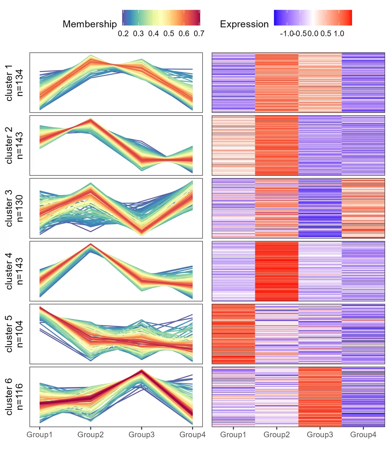
}R语言做趋势分析+热图
前言
经常能在文献中看到趋势分析和热图的合并图,自己手搓了一个自定义函数,其实就是折线图和热图拼接起来。
绘图前的数据准备
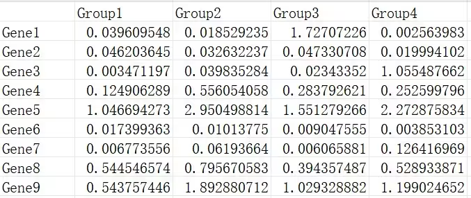
demo数据可以在https://www.r2omics.cn/res/demodata/mfuzz.xls下载。
数据包含2个维度,数据通常来源于搜库结果定量表,且需要有时序关系。一般都是用预处理后的数据,组内取平均值或中位数。
R语言怎么做
已提供示例数据,可直接运行。
可以直接用本篇提供的mfuzzHeatmap函数绘制趋势分析和热图的组合图,目前提供的可改参数只有聚类个数,其他细节修改可以直接修改函数对应的部分。
自定义函数 mfuzzHeatmap
调用自定义函数
# 代码来源:https://www.r2omics.cn/
# 读取时间序列分析数据文件
df = read.delim("https://www.r2omics.cn/res/demodata/mfuzz.xls",# 这里读取了网络上的demo数据,将此处换成你自己电脑里的文件
                row.names = 1
)
result = mfuzzHeatmap(
  data = df,       # 数据
  clusterNum = 6 # 聚类个数
)
211 genes excluded.
0 genes excluded.# 绘图
result$p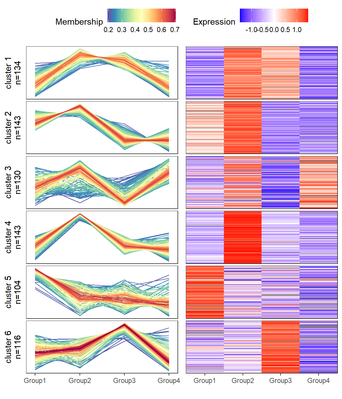
# 查看基因被聚到哪类中
head(result$dfcluster)
ID Cluster
1 Gene1 5
2 Gene2 6
3 Gene4 4
4 Gene5 3
5 Gene8 2
6 Gene9 4