# 代码来源:https://www.r2omics.cn/
# 加载必要库
library(tidyverse)
library(circlize)
library(RColorBrewer)
library(ComplexHeatmap)

# 核心绘图函数
circosEnrichmentPlot <- function(df,
                                 topN = 6,
                                 classCol = c("#f7cb16", "#65c3fc", "#bfe046", "#bdb5e3", "#fbccca", "#54beaa"),
                                 ifLog = FALSE,
                                 type = "base") {

  df.top  <- df %>%
    group_by(Class) %>%
    slice_min(PValue, n = topN, with_ties = FALSE) %>%
    arrange(desc(Ratio), .by_group = TRUE) %>%
    ungroup()

  main.col  <- classCol[as.numeric(as.factor(df.top$Class))]

  # 创建四个数据层
  df1 <- data.frame(TermID  = df.top$TermID,  start = 0, end = max(df.top$bg_pro_num,  na.rm  = TRUE))

  # 颜色映射
  p_max <- round(max(df.top$Enrichment))  + 1
  color_assign <- colorRamp2(0:p_max, colorRampPalette(c('#fee5d9', '#fb6a4a'))(p_max + 1))

  df2 <- data.frame(
    TermID = df.top$TermID,
    start = 0,
    end = df.top$bg_term_num,
    bg_term_num = df.top$bg_term_num,
    bg_term_num_col = color_assign(df.top$Enrichment)
  )

  # 根据类型处理前景数据
  if (type == "base") {
    df3 <- data.frame(
      TermID = df.top$TermID,
      start = 0,
      end = df.top$fg_term_num,
      fg_term_num = df.top$fg_term_num,
      color = "#ba55d3"
    )
  } else if (type == "sig") {
    tempLong <- if (ifLog) log10(max(df.top$bg_pro_num,  na.rm  = TRUE) + 1) else max(df.top$bg_pro_num,  na.rm  = TRUE)

    df3 <- bind_rows(
      data.frame(
        TermID = df.top$TermID,
        start = 0,
        end = df.top$Up  / (df.top$Up  + df.top$Down)  * tempLong,
        count = df.top$Up,
        color = "#69115dA1"
      ),
      data.frame(
        TermID = df.top$TermID,
        start = df.top$Up  / (df.top$Up  + df.top$Down)  * tempLong,
        end = tempLong,
        count = df.top$Down,
        color = "#838bc5"
      )
    ) %>% mutate(count = ifelse(count == 0, "", count))
  } else {
    stop("type must be 'base' or 'sig'")
  }

  # 比例数据
  df4 <- data.frame(
    TermID = df.top$TermID,
    start = 0,
    end = max(df.top$bg_pro_num,  na.rm  = TRUE),
    ratio = df.top$Ratio  / max(df.top$Ratio,  na.rm  = TRUE) * 10,
    col = main.col
  )

  # 坐标轴对数转换
  if (ifLog) {
    df1 <- mutate(df1, end = log10(end + 1))
    df2 <- mutate(df2, end = log10(end + 1))
    if (type == "base") df3 <- mutate(df3, end = log10(end + 1))
    df4 <- mutate(df4, end = log10(end + 1))
  }

  # 绘图设置
  par(omi = c(0.1, 0.1, 0.1, 1.5))
  circos.par(track.margin  = c(0.01, 0.01))

  # 初始化轨道
  circos.genomicInitialize(df1,  plotType = "none")

  # 第一轨道:分类标签
  circos.trackPlotRegion(
    ylim = c(0, 1),
    panel.fun  = function(x, y) {
      sector.index  <- get.cell.meta.data("sector.index")
      xlim <- get.cell.meta.data("xlim")
      ylim <- get.cell.meta.data("ylim")
      circos.text(mean(xlim),  mean(ylim), sector.index,
                  cex = 0.8, facing = "bending.inside",  niceFacing = TRUE)
    },
    track.height  = 0.08,
    bg.border  = NA,
    bg.col  = main.col
  )

  # 坐标轴
  if (!ifLog) {
    for (si in get.all.sector.index())  {
      circos.axis(
        h = "top",
        labels.cex  = 0.6,
        sector.index  = si,
        track.index  = 1,
        major.at  = pretty(c(0, max(df1$end, na.rm  = TRUE)), n = 5),
        labels.facing  = "clockwise"
      )
    }
  } else {
    for (si in get.all.sector.index())  {
      circos.axis(
        h = "top",
        labels.cex  = 0.6,
        sector.index  = si,
        track.index  = 1,
        major.at  = 0:5,
        labels = c(0, 10, 100, 1000, 10000),
        labels.facing  = "clockwise"
      )
    }
  }

  # 第二轨道:背景基因数
  circos.genomicTrack(
    df2,
    ylim = c(0, 1),
    track.height  = 0.1,
    bg.border  = "white",
    panel.fun  = function(region, value, ...) {
      circos.genomicRect(region,  value, ytop = 0, ybottom = 1,
                         col = value[, 2], border = NA, ...)
      circos.genomicText(region,  value, y = 0.5, labels = value[, 1],
                         adj = c(0.5, 0.5), cex = 0.8, ...)
    }
  )

  # 第三轨道:前景基因数
  circos.genomicTrack(
    df3,
    ylim = c(0, 1),
    track.height  = 0.1,
    bg.border  = "white",
    panel.fun  = function(region, value, ...) {
      circos.genomicRect(region,  value, ytop = 0, ybottom = 1,
                         col = value[, 2], border = NA, ...)
      circos.genomicText(region,  value, y = 0.5, labels = value[, 1],
                         cex = 0.9, adj = c(0.5, 0.5), ...)
    }
  )

  # 第四轨道:富集比例
  circos.genomicTrack(
    df4,
    ylim = c(0, 10),
    track.height  = 0.35,
    bg.border  = "white",
    bg.col  = "grey90",
    panel.fun  = function(region, value, ...) {
      cell.xlim  <- get.cell.meta.data("cell.xlim")
      cell.ylim  <- get.cell.meta.data("cell.ylim")
      for (j in 1:9) {
        y <- cell.ylim[1]  + (cell.ylim[2]  - cell.ylim[1])  / 10 * j
        circos.lines(cell.xlim,  c(y, y), col = "#FFFFFF", lwd = 0.3)
      }
      circos.genomicRect(region,  value, ytop = 0, ybottom = value[, 1],
                         col = value[, 2], border = NA, ...)
    }
  )

  circos.clear()

  # 添加图例
  if (type == "base") {
    middle.legend  <- Legend(
      labels = c('Number of Genes', 'Number of Select', 'Rich Factor(0-1)'),
      type = "points",
      pch = c(15, 15, 17),
      legend_gp = gpar(col = c('pink', '#BA55D3', main.col[1])),
      title = "",
      nrow = 3,
      size = unit(3, "mm")
    )
  } else {
    middle.legend  <- Legend(
      labels = c('Number of Genes', 'Number of Up', 'Number of Down', 'Rich Factor(0-1)'),
      type = "points",
      pch = c(15, 15, 15, 17),
      legend_gp = gpar(col = c('pink', '#69115dA1', '#838bc5', main.col[1])),
      title = "",
      nrow = 4,
      size = unit(3, "mm")
    )
  }

  circle_size <- unit(1, "snpc")
  draw(middle.legend,  x = circle_size * 0.42)

  # 主图例
  main.legend  <- Legend(
    labels = unique(df.top$Class),
    type = "points",
    pch = 15,
    legend_gp = gpar(col = classCol),
    title = "Class",
    nrow = 3,
    size = unit(3, "mm"),
    grid_height = unit(5, "mm"),
    grid_width = unit(5, "mm")
  )

  # P值图例
  logp.legend  <- Legend(
    col_fun = colorRamp2(
      round(seq(0, p_max, length.out  = 6), 0),
      colorRampPalette(c('#fee5d9', '#fb6a4a'))(6)
    ),
    legend_height = unit(3, 'cm'),
    labels_gp = gpar(fontsize = 8),
    title_position = 'topleft',
    title = '-Log10(Pvalue)'
  )

  lgd <- packLegend(main.legend,  logp.legend)
  draw(lgd, x = circle_size * 0.85, y = circle_size * 0.55, just = "left")
}R语言如何绘制富集圈图
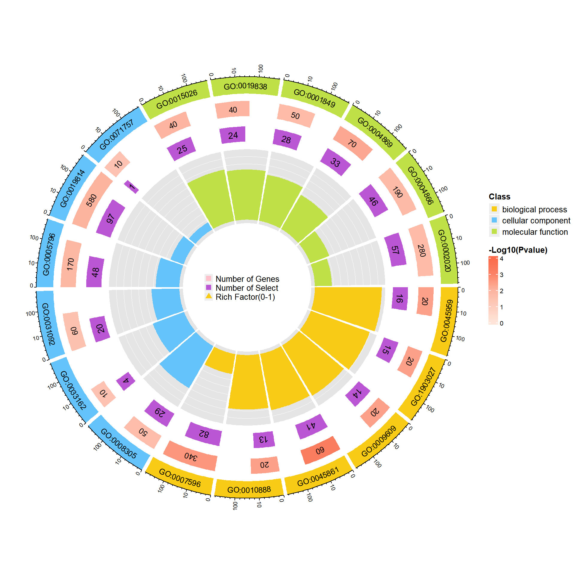
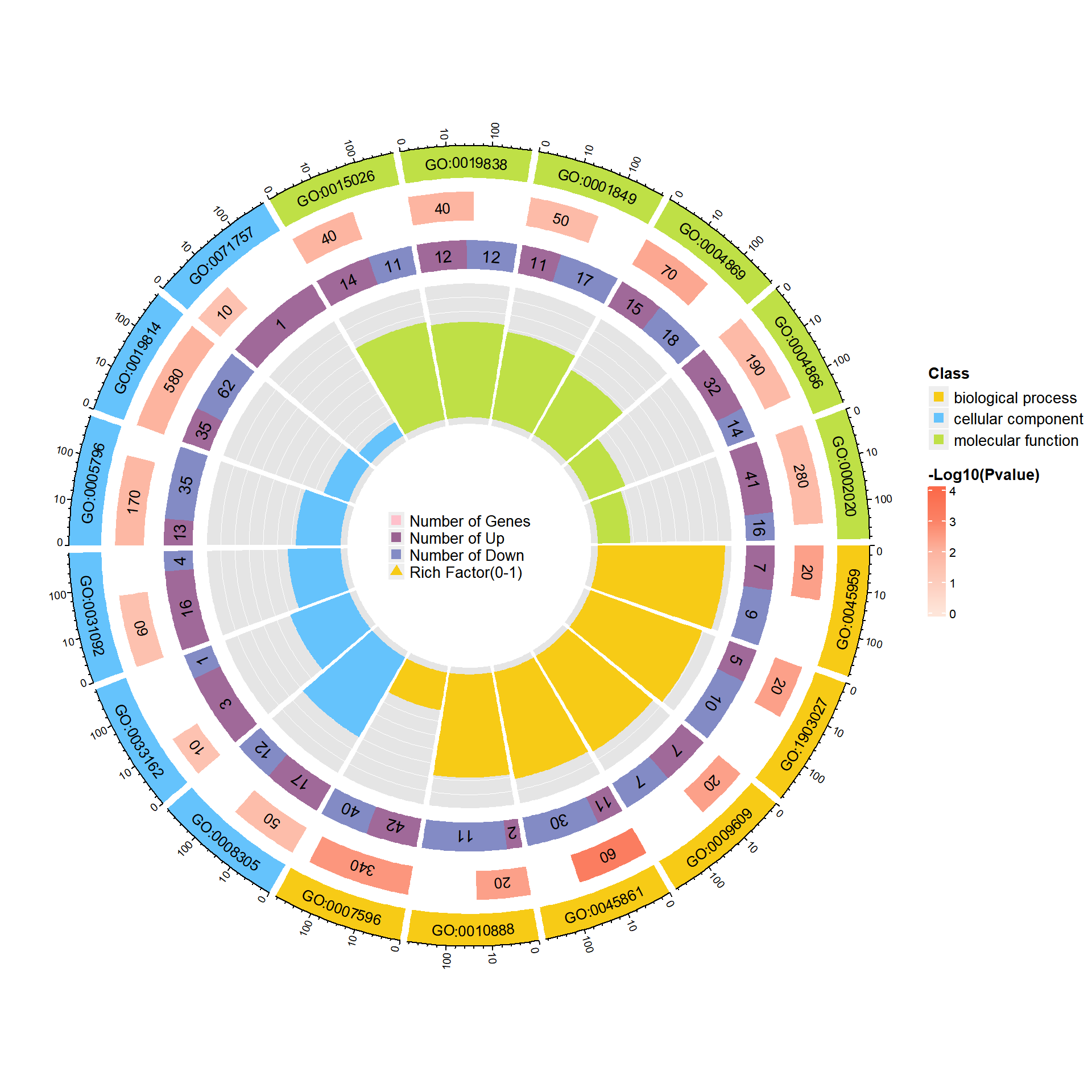
什么是富集圈图?
富集圈图(Enrichment Circle Plot)是一种展示基因富集分析结果的可视化工具。下图由四个圈组成,展示了从外到内的不同信息。下面是各个圈的详细描述:
第一圈:富集的分类
这一圈显示的是基因富集的不同分类,基因可以根据功能、通路或其他特征被划分为不同类别。每个类别由不同的颜色表示,以便清晰区分。第二圈:背景基因中的分类数目及P值
这一圈显示每个分类中背景基因的数目,同时标注该分类的统计显著性值。基因数目较多的条形图较长,而P值越小,富集度越高的部分颜色越红,表明该分类的富集显著性越强。这一圈的作用是展示该分类在背景基因中的频次及其统计显著性。第三圈:上下调基因比例条形图
这一圈展示了每个分类中上调和下调基因的比例。条形图上,深紫色代表上调基因的比例,浅紫色代表下调基因的比例。条形的长度表示该分类中上下调基因的比例,图下方还会显示具体的比例数值。如果输入的差异基因数据没有区分上下调基因(即只有一列数据),第三圈将显示前景基因的总数目。第四圈:Ratio值
这一圈展示了每个分类的Ratio值,即该分类中前景基因的数量与背景基因的比例。Ratio值越高,说明该分类中的基因越富集。背景基因的辅助线帮助用户理解Ratio值,每个小格表示0.1的富集倍数。
综上所述,富集圈图通过层层递进的方式提供了富集分析的多个维度信息,帮助研究者全面了解不同基因分类的富集情况和差异。

绘图前的数据准备
demo数据可以在这里下载
http://r2omics.cn/res/demodata/enrichCircos/data.txt
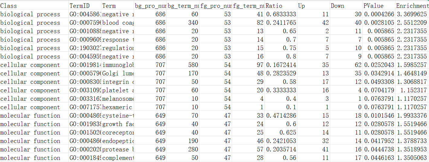
这段表格包含了富集分析结果的相关数据,其中每一列代表不同的指标。下面逐个解释各列的含义:
Class:该列表示所分析的基因分类的类型。
TermID:这是每个富集条目对应的唯一标识符。
Term:这是与"TermID"对应的富集项的名称或描述。
bg_pro_num:表示背景基因集中与该富集项相关的基因总数。
bg_term_num:背景基因集中实际与该富集项相关的基因数目。
fg_pro_num:表示前景基因集中与该富集项相关的基因总数。
fg_term_num:前景基因集中实际与该富集项相关的基因数目。
Ratio:该列表示前景基因集中富集项相关基因数量与背景基因集中富集项相关基因数量的比值。
Up:该列显示前景基因集中上调基因的数量。
Down:该列显示前景基因集中下调基因的数量。
PValue:P值是用于评估该富集项是否具有统计显著性的值。
Enrichment: -log10(PValue)
R语言如何绘制富集圈图
加载配置自定义函数,之后直接调用即可
调用函数绘图,绘制包含差异信息的富集圈图,type = “sig”
# 代码来源:https://www.r2omics.cn/
# 读取数据
df <- read.delim("http://r2omics.cn/res/demodata/enrichCircos/data.txt")  %>% tibble()

# 绘图
circosEnrichmentPlot(
  df,
  topN = 6,     # 每个类别最多画几个
  classCol = c("#f7cb16", "#65c3fc", "#bfe046", "#bdb5e3", "#fbccca", "#54beaa"),
  ifLog = T,    # 是否将坐标轴取个log10
  type = "sig"  # 2中类型,base和sig。sig相比base是前景基因显示上下调
)
调用函数绘图,绘制仅显示前景富集条目的个数的富集圈图,type = “base”
# 代码来源:https://www.r2omics.cn/
# 读取数据
df <- read.delim("http://r2omics.cn/res/demodata/enrichCircos/data.txt")  %>% tibble()

# 绘图
circosEnrichmentPlot(
  df,
  topN = 6,     # 每个类别最多画几个
  classCol = c("#f7cb16", "#65c3fc", "#bfe046", "#bdb5e3", "#fbccca", "#54beaa"),
  ifLog = T,    # 是否将坐标轴取个log10
  type = "base"  # 2中类型,base和sig。sig相比base是前景基因显示上下调
)