# A tibble: 32 × 11
     mpg   cyl  disp    hp  drat    wt  qsec    vs    am  gear  carb
   <dbl> <dbl> <dbl> <dbl> <dbl> <dbl> <dbl> <dbl> <dbl> <dbl> <dbl>
 1  21       6  160    110  3.9   2.62  16.5     0     1     4     4
 2  21       6  160    110  3.9   2.88  17.0     0     1     4     4
 3  22.8     4  108     93  3.85  2.32  18.6     1     1     4     1
 4  21.4     6  258    110  3.08  3.22  19.4     1     0     3     1
 5  18.7     8  360    175  3.15  3.44  17.0     0     0     3     2
 6  18.1     6  225    105  2.76  3.46  20.2     1     0     3     1
 7  14.3     8  360    245  3.21  3.57  15.8     0     0     3     4
 8  24.4     4  147.    62  3.69  3.19  20       1     0     4     2
 9  22.8     4  141.    95  3.92  3.15  22.9     1     0     4     2
10  19.2     6  168.   123  3.92  3.44  18.3     1     0     4     4
# ℹ 22 more rows
R语言如何绘制相关性图
前言
本篇是ggcorrplot2包绘制相关性图的教程。
什么是相关性图?
相关性是指两个或多个变量之间的关系或相互影响程度。若两组的值一起增大,我们称之为正相关,若一组的值增大时,另一组的值减小,我们称之为负相关。其值介于-1与1之间,即越接近1,越正相关;越接近-1,越负相关。
常见的有两种计算相关性的算法:皮尔逊相关性(pearson)和斯皮尔曼相关性(spearman)。皮尔逊相关性最常用,适合正态分布的数据。斯皮尔曼相关性是秩相关,不受极大极小值的影响。
在组学中的应用,例如,两个技术性重复实验的结果相关性很低,则说明数据有异常。
需要注意的地方,做样本之间的相关性的时候,蛋白之间要对应,不可随意打乱顺序。数据中有缺失值的情况,通常用”pairwise.complete.obs”算法处理缺失值,即两两配对删除缺失值。
相关性图就是,用图的形式展现出相关性的结果。
绘图前的数据准备
这里就用R语言自带的示例数据了,mtcars
R语言如何绘制相关性图
ggcorrplot2主要有2个函数ggcorrplot和ggcorrplot.mixed。ggcorrplot函数是只能绘制一种图案;ggcorrplot.mixed函数上下部分分别绘制。
ggcorrplot函数:
# 代码来源:https://www.r2omics.cn/
# 加载包
library(ggcorrplot2) # devtools::install_github("caijun/ggcorrplot2")
library(psych) # 提供corr.test函数,计算相关性和p值
# 计算相关性和p值
ct = corr.test(mtcars, adjust = "none")
corr = ct$r
p.mat = ct$p
# 绘图
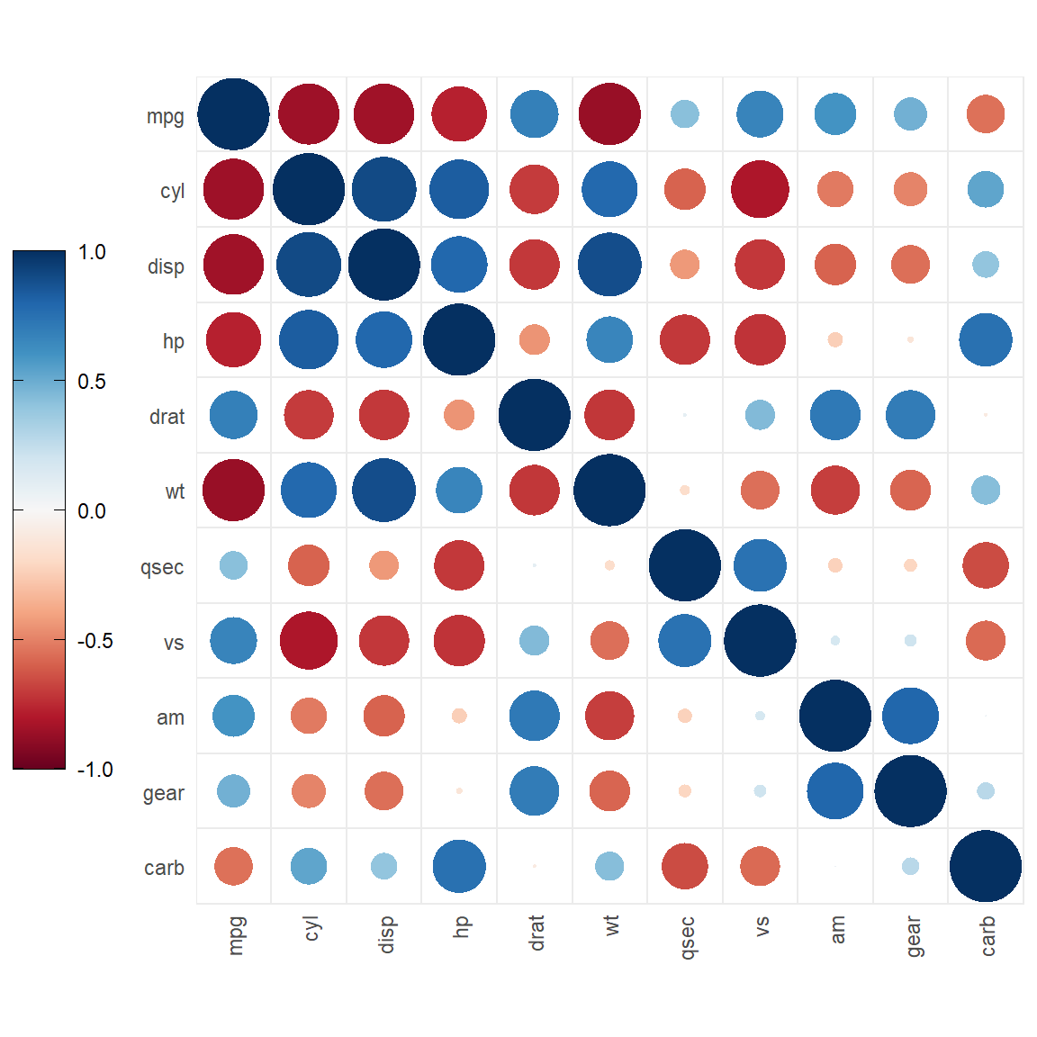
# 只绘制一种图形
ggcorrplot(
corr, # 相关性数据
method = "circle", # 绘制的图案"circle"圆, "square"方块, "ellipse"椭圆, "number"数字,
type = "full", # 绘制范围 "full"全部, "lower"下半部分, "upper"上半部分,
p.mat = p.mat, # p值数据
col = colorRampPalette(c('#0000ff','#ffffff','#ff0000'))(100), # 主体颜色
sig.lvl = 0.05, # 设置范围,当p大于sig.lvl时触发下面的动作
number.digits = 2, # 相关性数字标签,保留的小数点位数
show.diag = T, # 是否显示主对角线上的内容
insig ="pch", # p值大于sig.lvl时的图案方案c("pch"图案, "blank"空白, "label_sig"星号,显著性标签),
pch = 4, # 当insig = "pch"时的图案形状 4为叉
pch.cex = 5 # 图案大小
)
ggcorrplot.mixed函数上下部分分别绘制
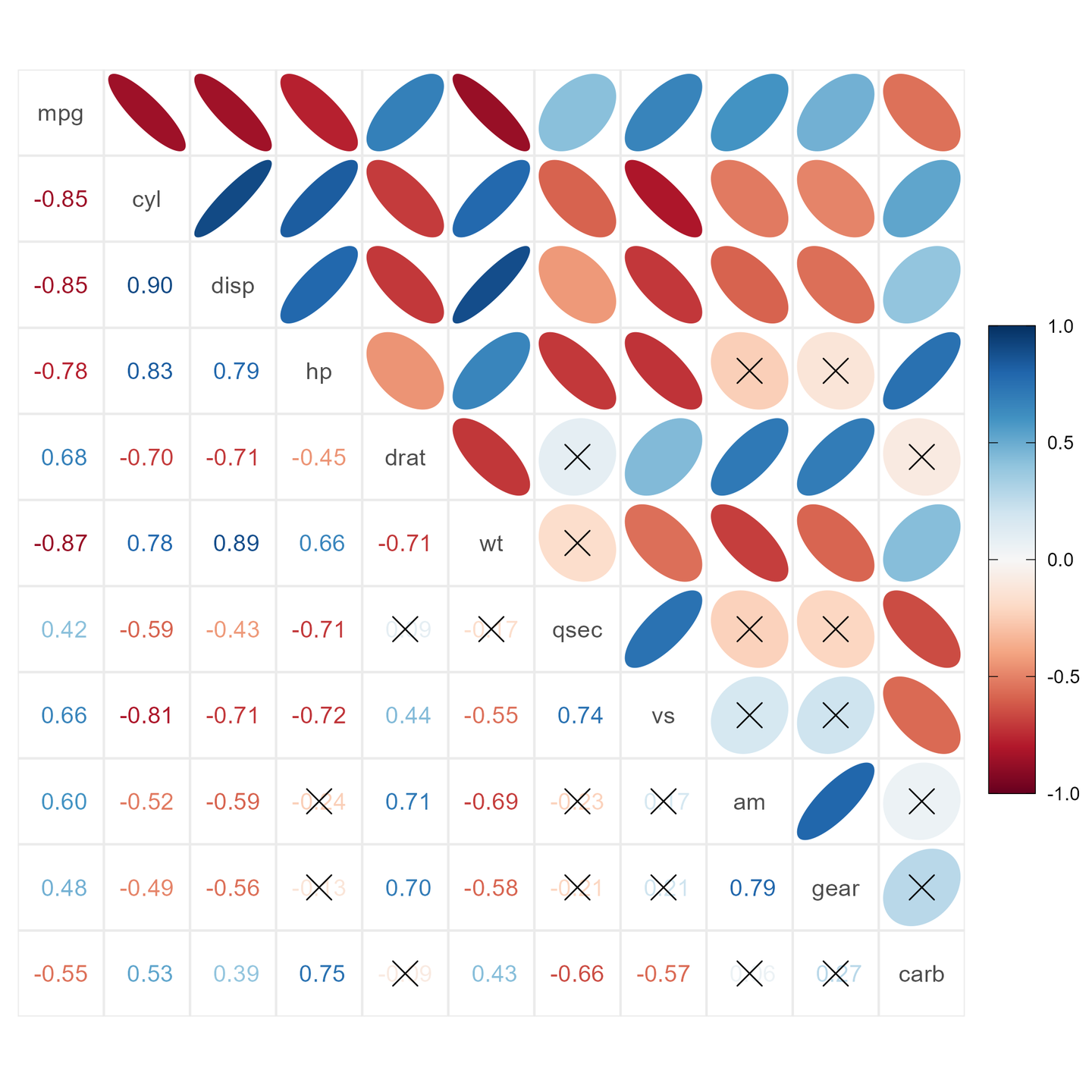
# 上下部分分别绘制
ggcorrplot.mixed(
  corr,              # 相关性数据
  upper = "circle",  # 上半部分绘制的图案"circle"圆, "square"方块, "ellipse"椭圆, "number"数字,
  lower = "number",  # 下半部分绘制的图案"circle"圆, "square"方块, "ellipse"椭圆, "number"数字,
  col = colorRampPalette(c('#0000ff','#ffffff','#ff0000'))(100), # 主体颜色
  p.mat =  p.mat,    # p值数据
  sig.lvl = 0.05,    # 设置范围,当p大于sig.lvl时触发下面的动作
  number.digits = 2, # 相关性数字标签,保留的小数点位数
  insig = "pch",     # p值大于sig.lvl时的图案方案c("pch"图案, "blank"空白, "label_sig"星号,显著性标签),
  pch = 4,           # 当insig = "pch"时的图案形状 4为叉
  pch.cex = 5        # 图案大小
)
附录
两个函数介绍完了,我们来看看它都能画出什么样子的图。
ggcorrplot示例
ggcorrplot(corr)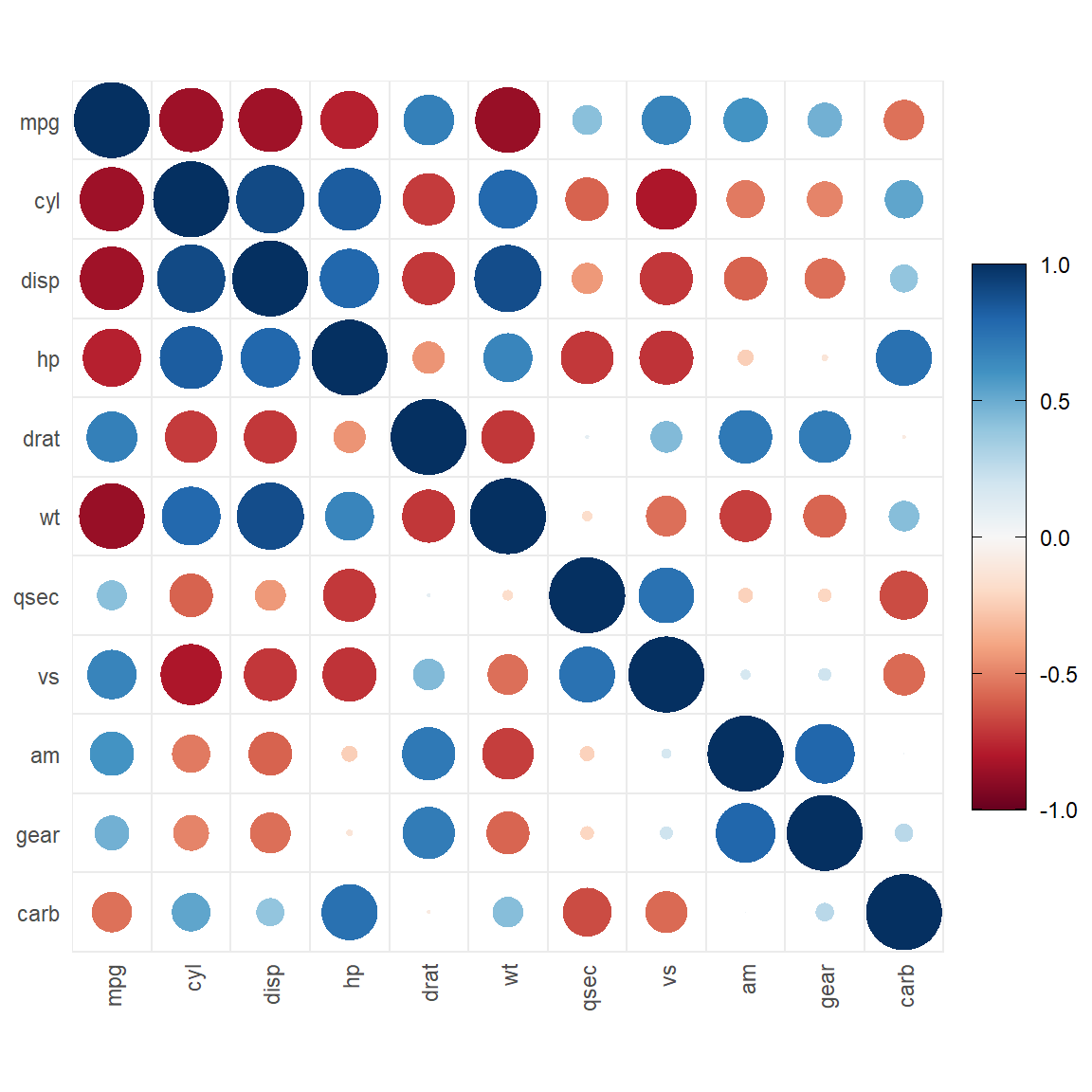
图案改为方块
ggcorrplot(corr, method = "square")
图案改为椭圆
ggcorrplot(corr, method = "ellipse")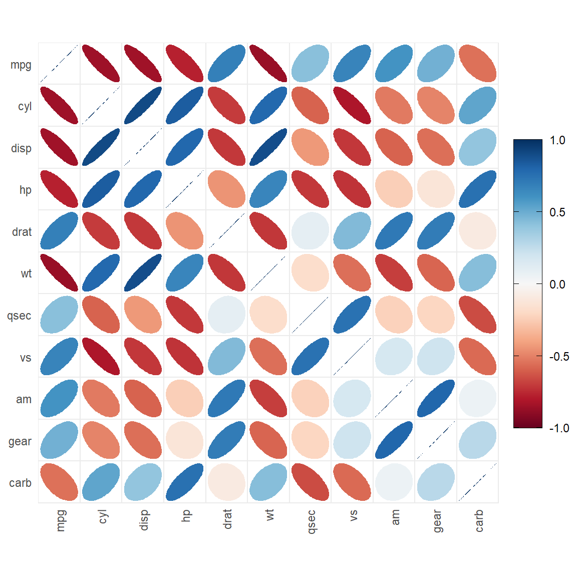
图案改为数字
ggcorrplot(corr, method = "number")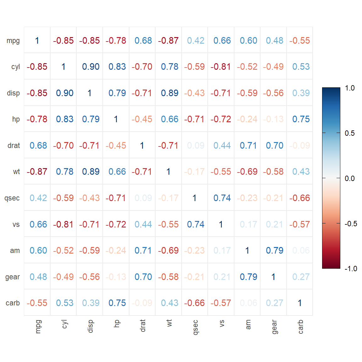
只在上半部分绘图
ggcorrplot(corr, type = "upper")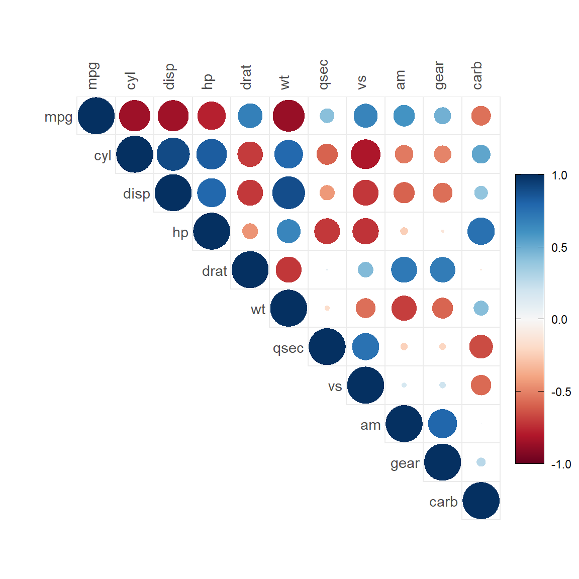
只在下半部分绘图
ggcorrplot(corr, type = "lower")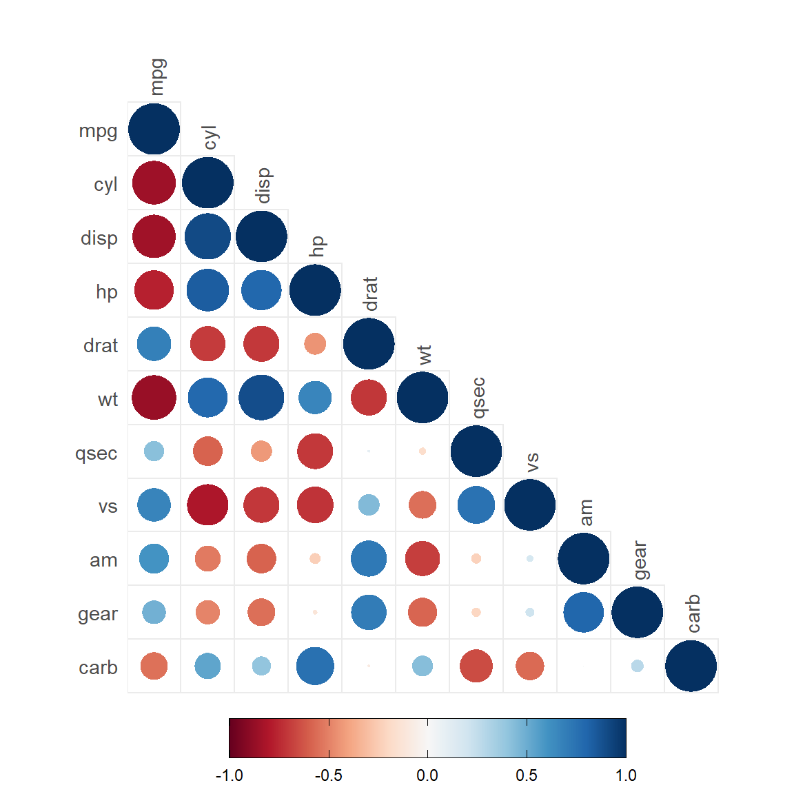
ggcorrplot.mixed函数示例
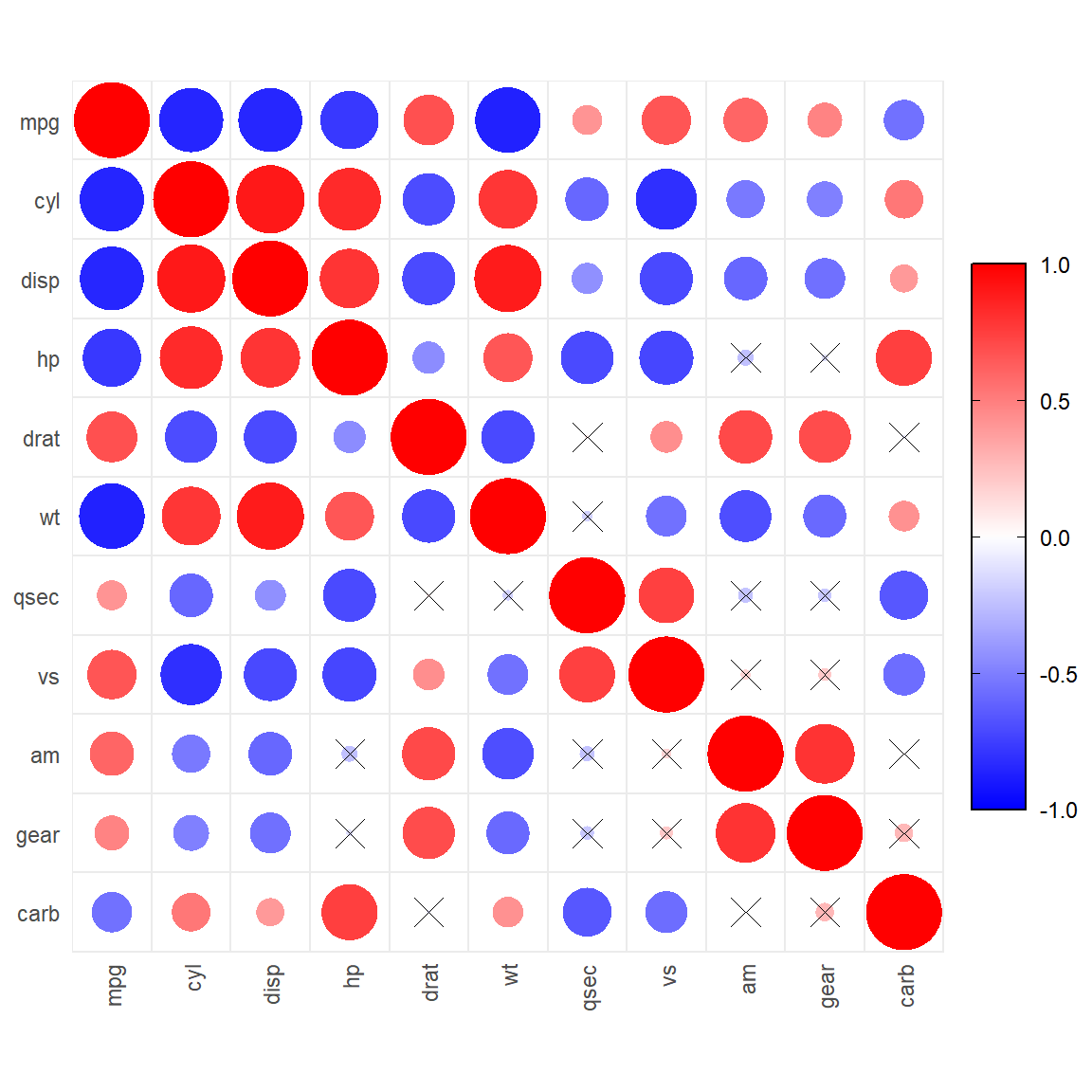
ggcorrplot.mixed(corr)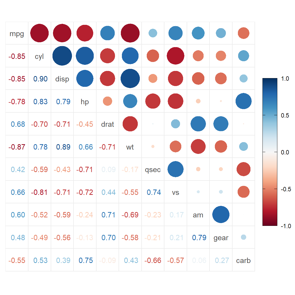
上半部分绘制椭圆,下半部分绘制数字
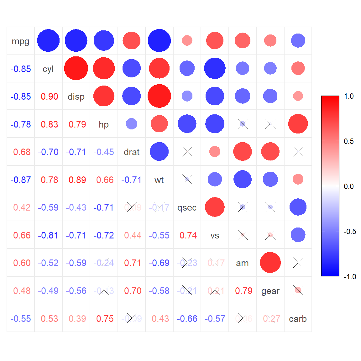
ggcorrplot.mixed(corr, upper = "ellipse", lower = "number")
添加p值矩阵,大于阈值的画叉
ggcorrplot.mixed(corr, upper = "ellipse", lower = "number", p.mat = p.mat)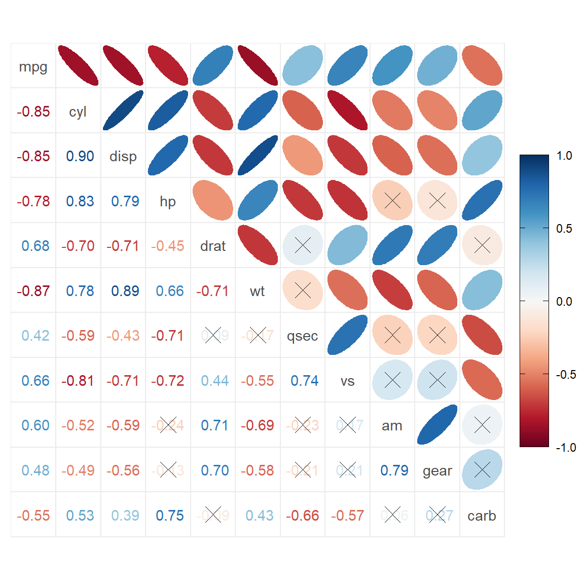
添加p值矩阵,大于阈值的留空白
ggcorrplot.mixed(corr, upper = "ellipse", lower = "number", p.mat = p.mat,
                 insig = "blank")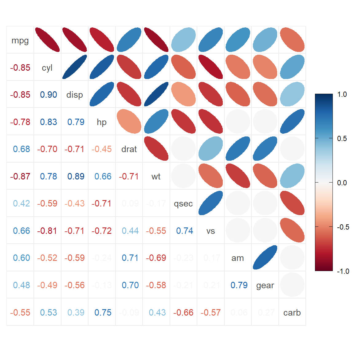
添加p值白浅 小于0.05的用”*“表示,小于0.01的用”**“表示,小于0.001的用”***“表示
ggcorrplot.mixed(corr, upper = "ellipse", lower = "number", p.mat = p.mat,
                 insig = "label_sig", sig.lvl = c(0.05, 0.01, 0.001))
因为ggcorrplot2包底层使用ggplot2语法写的,所以拓展上还支持其他的ggplot2语法
例如将图例放到左侧
library(ggplot2)
ggcorrplot(corr)+
  theme(
    legend.position = "left"
  )