# A tibble: 150 × 5
   Sepal.Length Sepal.Width Petal.Length Petal.Width Species
          <dbl>       <dbl>        <dbl>       <dbl> <fct>
 1          5.1         3.5          1.4         0.2 setosa
 2          4.9         3            1.4         0.2 setosa
 3          4.7         3.2          1.3         0.2 setosa
 4          4.6         3.1          1.5         0.2 setosa
 5          5           3.6          1.4         0.2 setosa
 6          5.4         3.9          1.7         0.4 setosa
 7          4.6         3.4          1.4         0.3 setosa
 8          5           3.4          1.5         0.2 setosa
 9          4.4         2.9          1.4         0.2 setosa
10          4.9         3.1          1.5         0.1 setosa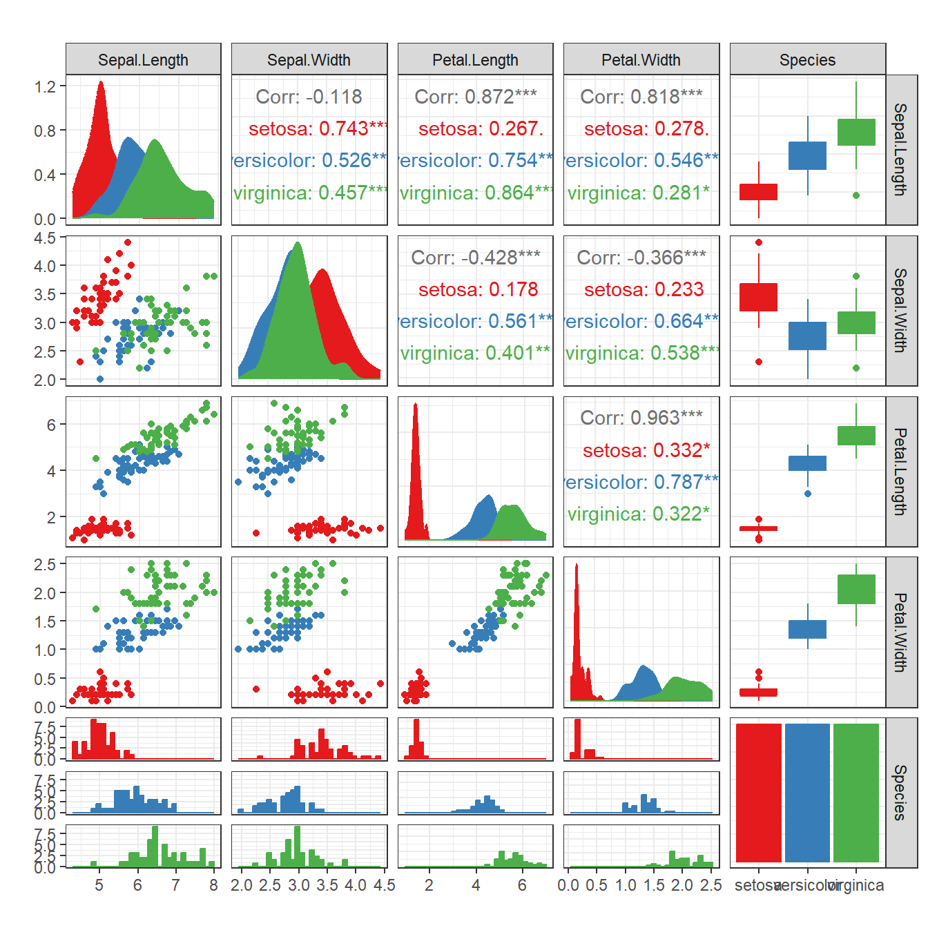
# ℹ 140 more rowsR语言如何绘制相关性矩阵
什么是相关性矩阵?
相关性是指两个或多个变量之间的关系或相互影响程度。若两组的值一起增大,我们称之为正相关,若一组的值增大时,另一组的值减小,我们称之为负相关。其值介于-1与1之间,即越接近1,越正相关;越接近-1,越负相关。
常见的有两种计算相关性的算法:皮尔逊相关性(pearson)和斯皮尔曼相关性(spearman)。皮尔逊相关性最常用,适合正态分布的数据。斯皮尔曼相关性是秩相关,不受极大极小值的影响。
在组学中的应用,例如,两个技术性重复实验的结果相关性很低,则说明数据有异常。
需要注意的地方,做样本之间的相关性的时候,蛋白之间要对应,不可随意打乱顺序。数据中有缺失值的情况,通常用”pairwise.complete.obs”算法处理缺失值,即两两配对删除缺失值。
计算完相关性后,我们通过相关性矩阵做可视化。矩阵的上下中多个个面板支持多种图案,有热力图,柱形图,散点图,折线图,饼图等多种模式可供选择。
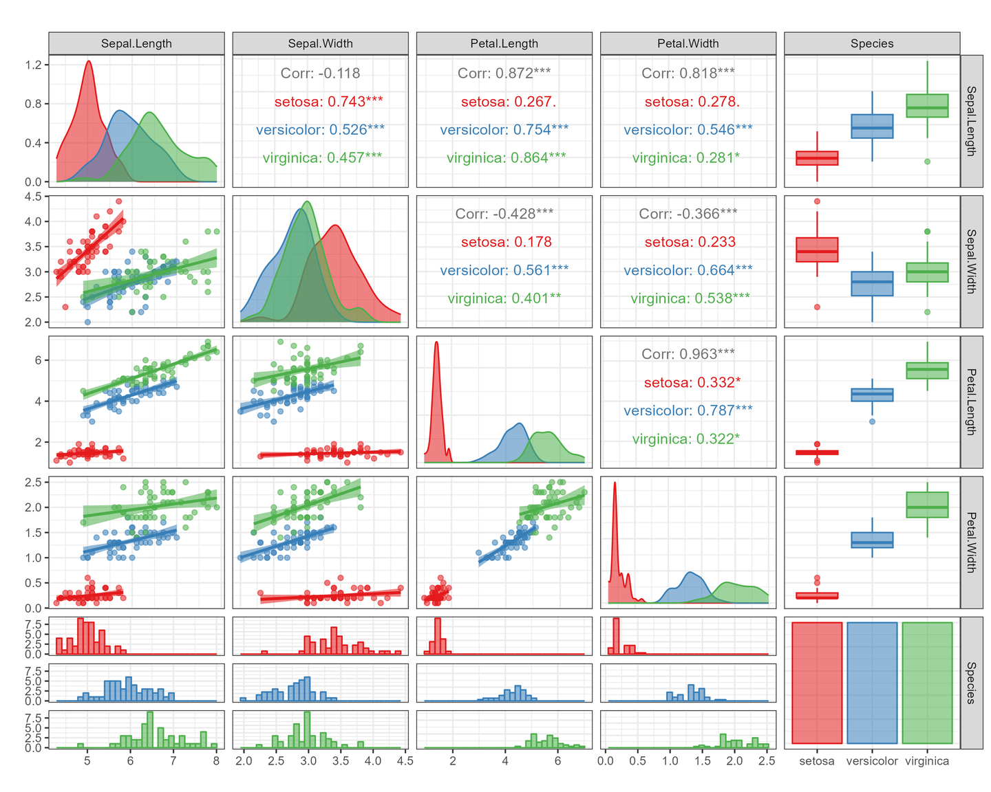
绘图前的数据准备
这里就用R语言自带的示例数据了,iris
R语言如何绘制相关性矩阵图
本篇是用R包GGally做相关性矩阵图的教程
# 代码来源:https://www.r2omics.cn/
library(GGally)

# 绘图
ggpairs(
  data = iris,                                    # 数据
  mapping = aes(fill = Species, color = Species), # 映射,同ggplot2
  # columns = 1:ncol(data),                       # 对选中的列绘图,默认是全部列
  upper = list(                                   # 指定上方面板,各种情况下的使用的图形,有哪些参数见下方附录
    continuous = "cor",                           # xy轴都是连续型向量时的图案
    combo = "box_no_facet",                       # xy轴有一个时候连续型,另一个是离散型时的图案
    discrete = "count",                           # xy轴都是离散型向量时的图案
    na = "blank"                                  # 当某个方向的数据全为NA时,显示的内容
  ),
  lower = list(                                   # 指定下方面板,各种情况下的使用的图形
    continuous = "points",
    combo = "facethist",
    discrete = "facetbar",
    na = "na"
  ),
  diag = list(                                    # 指定中间面板,各种情况下的使用的图形
    continuous = "densityDiag",
    discrete = "barDiag",
    na = "naDiag"
  ),
  axisLabels = "show",                            # 轴标签的显示方式,内部显示:internal 不显示:none
  # columnLabels = c("a", "b", "c", "d", "e"),    # 分面标签显示的名称,默认为列名
  switch = NULL,                                  # 分面标签的位置,x:右下, y:左上, both:左下, NULL:右上
  showStrips = NULL                               # NULL:只显示右上方的分页标签   True:显示所有矩阵中的分页标签
)+
  # ggpairs底层基于ggplot2, 可以用其他的ggplot2语法修改,例如
  theme_bw()+                                     # 主题
  scale_fill_manual(values = c("#e41a1c", "#377eb8", "#4daf4a", "#984ea3")) +   # fill调色
  scale_color_manual(values = c("#e41a1c", "#377eb8", "#4daf4a", "#984ea3"))+   # color调色
  labs(         # 坐标轴名称选项
    x = "",     # x轴名称
    y = "",     # y轴名称
    title = ""  # 标题名字
  )
附录:
该包提供的上下中面板中的形状有很多,可以在https://ggobi.github.io/ggally/articles/ggally_plots.html参考
上下面板
continuous:xy轴都是连续型向量时的图案
cor:相关性数字
density:二维密度图
points:散点图
smooth, smooth_lm, smooth_loess:带回归线的散点图
discrete: xy轴都是离散型向量时的图案
colbar:百分比簇状图
autopoint
count cross crosstable :tile 系列
facetbar
ratio
rowbar

table
trends
combo: xy轴有一个时候连续型,另一个是离散型时的图案
autopoint
box box_no_facet
denstrip
dot dot_no_facet
facetdensitystrip
facethist
summarise_by
trends
na: 当某个方向的数据全为NA时,显示的内容
blank
na
中间面板
continuous
‘densityDiag’, ‘barDiag’, ‘blankDiag’
discrete
‘barDiag’, ‘blankDiag’
na
‘naDiag’, ‘blankDiag’