# A tibble: 5,257 × 2
x y
<dbl> <dbl>
1 3.95 -0.81
2 3.89 1.05
3 2.88 -0.58
4 3.4 0.06
5 3.71 -0.01
6 3.84 -0.45
7 2.7 -0.13
8 4.14 0.79
9 3.93 0.4
10 3.58 0.49
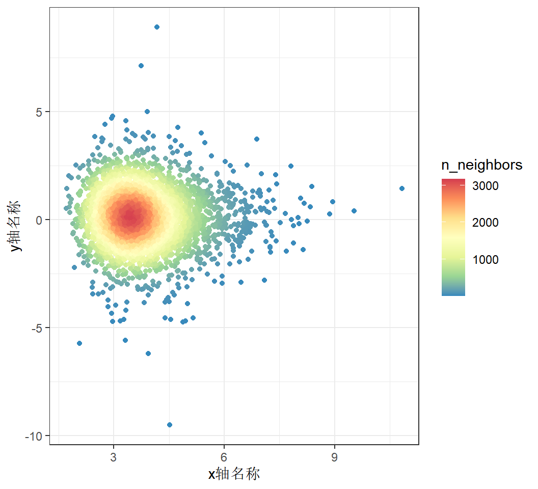
# ℹ 5,247 more rowsR语言如何绘制散点密度图
什么是散点密度图
散点密度图是在散点图的基础上,计算了每个散点周围分布了多少其他的点,并通过颜色表现出来。
当数据很多的时候,散点图上的点就会存在很多重叠,这时候比较难以看出其分布特征,需要一个辅助的指标来了解密集程度,通常用颜色图例来标识密集程度。
绘图前的数据准备
数据包含2列,需要有列名。第一列是x轴坐标,第二列是y轴坐标。
demo数据可以从这下载:https://www.r2omics.cn/res/demodata/pointDensity.txt
R语言如何绘制散点密度图
# 代码来源:https://www.r2omics.cn/
library(ggpointdensity)
library(ggplot2)

# 读文件
df = read.delim("https://www.r2omics.cn/res/demodata/pointDensity.txt")

# 绘图
ggplot(df,aes(x=df[,1],
              y=df[,2])
)+
  geom_pointdensity(adjust = 4)+                              # adjust:设置neighbors范围
  theme_bw()+
  labs(x="x轴名称",y="y轴名称")+
  scale_color_distiller(palette = "Spectral", direction = -1) # 设置连续型颜色