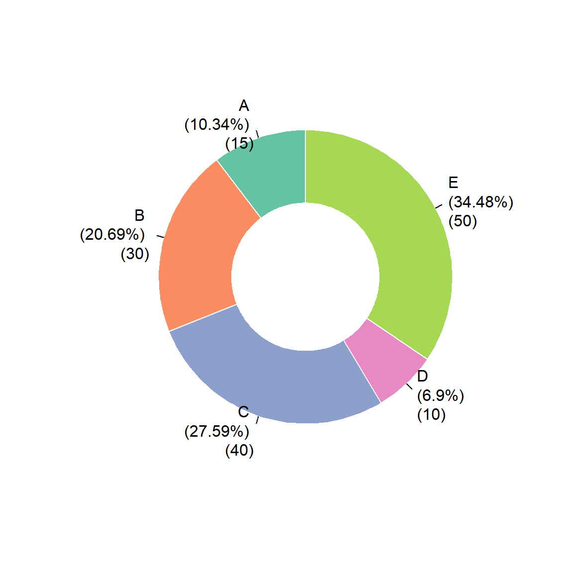
# A tibble: 5 × 2
  group value
  <chr> <int>
1 A        15
2 B        30
3 C        40
4 D        10
5 E        50
R语言如何绘制甜甜圈图
什么是甜甜圈图?
饼图是一种常用的统计图表,用于展示各部分占整体的比例。它通常以一个圆形表示,圆形被切分成不同的扇形,每个扇形的大小与其所代表的数值成正比。
甜甜圈图其实就是中间套个洞的饼图,也称为圆环图或环形图。

绘图前的数据准备
demo数据可以在https://www.r2omics.cn/res/demodata/pie.txt下载。
包含2列数据,第一列是名称,第二列是数值。
R语言如何绘制甜甜圈图
graphics包并没有直接画甜甜圈图的函数,所以在饼图源代码的基础上改改,下面的自定义函数可以直接调用。
doughnut <- function (x, labels = names(x), edges = 200, outer.radius = 0.8,
                      inner.radius=0.6, clockwise = FALSE,
                      init.angle = if (clockwise) 90 else 0, density = NULL,
                      angle = 45, col = NULL, border = FALSE, lty = NULL,
                      main = NULL, ...)
{
  if (!is.numeric(x) || any(is.na(x) | x < 0))
    stop("'x' values must be positive.")
  if (is.null(labels))
    labels <- as.character(seq_along(x))
  else labels <- as.graphicsAnnot(labels)
  x <- c(0, cumsum(x)/sum(x))
  dx <- diff(x)
  nx <- length(dx)
  plot.new()
  pin <- par("pin")
  xlim <- ylim <- c(-1, 1)
  if (pin[1L] > pin[2L])
    xlim <- (pin[1L]/pin[2L]) * xlim
  else ylim <- (pin[2L]/pin[1L]) * ylim
  plot.window(xlim, ylim, "", asp = 1)
  if (is.null(col))
    col <- if (is.null(density))
      palette()
  else par("fg")
  col <- rep(col, length.out = nx)
  border <- rep(border, length.out = nx)
  lty <- rep(lty, length.out = nx)
  angle <- rep(angle, length.out = nx)
  density <- rep(density, length.out = nx)
  twopi <- if (clockwise)
    -2 * pi
  else 2 * pi
  t2xy <- function(t, radius) {
    t2p <- twopi * t + init.angle * pi/180
    list(x = radius * cos(t2p),
         y = radius * sin(t2p))
  }
  for (i in 1L:nx) {
    n <- max(2, floor(edges * dx[i]))
    P <- t2xy(seq.int(x[i], x[i + 1], length.out = n),
              outer.radius)
    polygon(c(P$x, 0), c(P$y, 0), density = density[i],
            angle = angle[i], border = border[i],
            col = col[i], lty = lty[i])
    Pout <- t2xy(mean(x[i + 0:1]), outer.radius)
    lab <- as.character(labels[i])
    if (!is.na(lab) && nzchar(lab)) {
      lines(c(1, 1.05) * Pout$x, c(1, 1.05) * Pout$y)
      text(1.1 * Pout$x, 1.1 * Pout$y, labels[i],
           xpd = TRUE, adj = ifelse(Pout$x < 0, 1, 0),
           ...)
    }
    Pin <- t2xy(seq.int(0, 1, length.out = n*nx),
                inner.radius)
    polygon(Pin$x, Pin$y, density = density[i],
            angle = angle[i], border = border[i],
            col = "white", lty = lty[i])
  }

  title(main = main, ...)
  invisible(NULL)
}
调用doughnut函数绘制甜甜圈图
# 代码来源:https://www.r2omics.cn/
# 加载R包,没有安装请先安装  install.packages("包名")
library(graphics)

# 读取饼图/甜甜圈图数据文件
df= read.delim("https://www.r2omics.cn/res/demodata/pie.txt") # 这里读取了网络上的demo数据,将此处换成你自己电脑里的文件

# 设置标签样式(名称+百分比+原数值)
labs <- paste0(df$group," \n(", round(df$value/sum(df$value)*100,2), "%)"," \n(",df$value, ")")

# 绘图
doughnut(
  df$value,
  labels=labs,
  init.angle=90,     # 设置初始角度
  col = RColorBrewer::brewer.pal(nrow(df),"Set2"), # 设置颜色,根据实际个数设置颜色
  border="white",    # 边框颜色
  inner.radius= 0.4, # 内环大小
  cex = 1)           # 字体大小